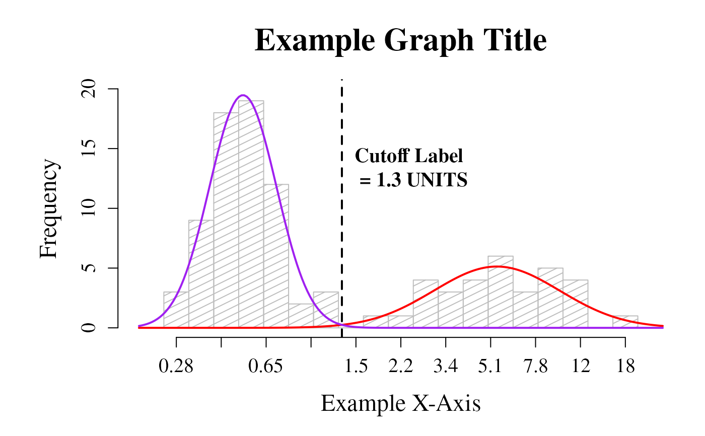
Plot a histogram of the dataset that includes the curves for each mode and the cutoff value
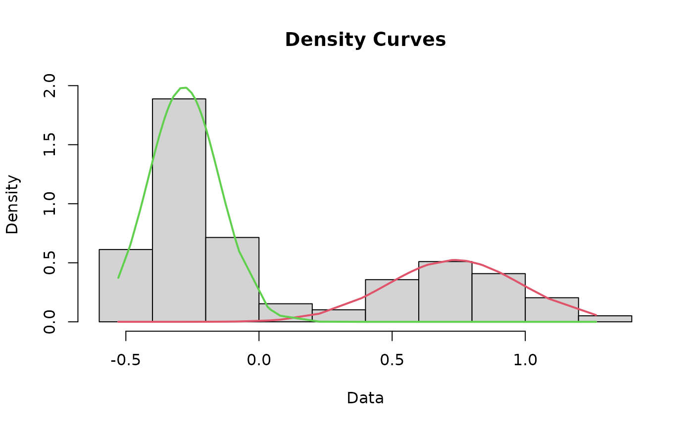
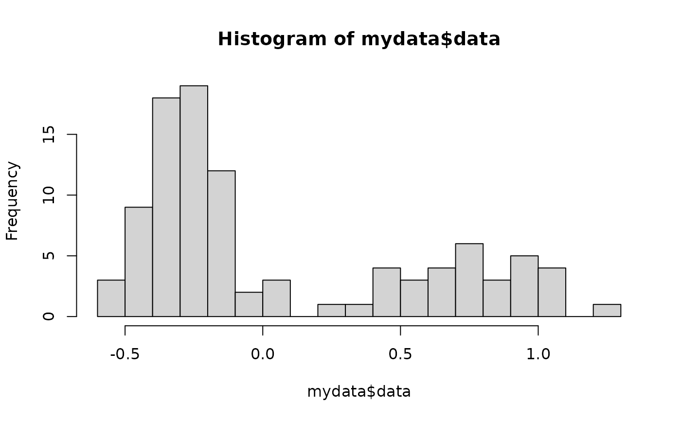
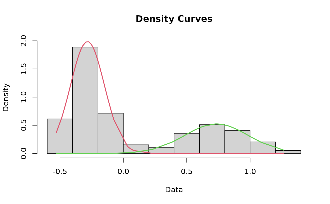
cutoffPlot.RdThis function incorporates most of the other functions in this package to plot a histogram of the data that includes the fit lines for each mode and the cutoff value depicted as a line. As a matter of course, this function runs the cleanData, datamodel, fit, curves, and findCutoff functions for you, negating the need to run those separately.
Usage
cutoffplot(
  x = cutoffvalue:::exampledata,
  title = "Plasma 11-KT levels in age-2 male spring chinook",
  xlab = "Plasma [11-KT] (ng/mL)",
  cutofflab = "Minijack cutoff",
  cutoffunits = "ng/mL",
  LowerMode_col = "red",
  LowerMode_lty = 1,
  LowerMode_lwd = 2,
  UpperMode_col = "purple",
  UpperMode_lty = 1,
  UpperMode_lwd = 2,
  cutoffvalue_col = "black",
  cutoffvalue_lty = 2,
  cutoffvalue_lwd = 2
)
Arguments
- x
Your dataset specified as "DatasetName$ColumnName" or converted to a numeric list with a name (e.g., "yourrawdata <- as.numeric(yourrawdata$columnname)"). Regardless of how you import or specify it, data should be a single column of log-transformed data.
- title
Title for the graph, default is blank
- xlab
Label for the x-axis, default is "Plasma 11-KT (ng/mL)"
- cutofflab
Label for the cutoff value, default is "Minijack cutoff"
- cutoffunits
Label for the units, default is "ng/mL"